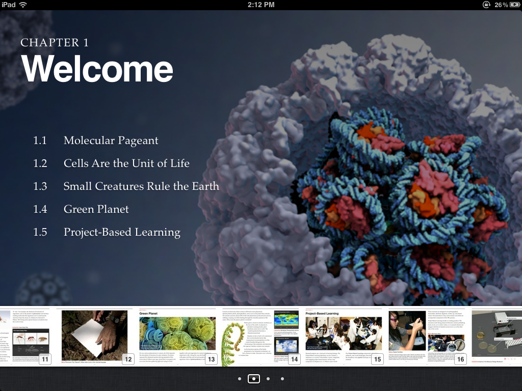
Among all the releases during yesterday’s special event, Apple updated its desktop app devoted to the creation of iBooks. Since the very first release in February, it has served well to me and I used to produce several different books.
One thing that I didn’t like was related to the orientation of the books. The first run of templates were only great when used in landscape mode, becoming quite terrible once in portrait. You could prevent the ugliness by locking the orientation but I always felt like there could be room for great portrait books.
Apparently Apple felt the same because with the update you now have great portrait themes. My only question is: why are they complete separate entities from the landscape version?
To be clear, when you start a book you are now obliged to select an orientation and stick with it. There’s no more rotation capability. Why? Why wouldn’t they integrate the new portrait-optimized themes with the landscape ones? It would finally make for a great reading experience.
Let me format text and pictures for the two orientations and then merge them together to serve one book.
This look especially silly because they have the same themes in both orientation, is not like they’ve created two completely different sets.
Since the next production will be again photo-centric I guess I’ll go for the landscape version but I still feel like the two versions combined would have served a better overall experience.

