When I first heard that Paper was a creation by Mike Matas I already knew it was going to be good. The thing is that it’s really great, not just good.
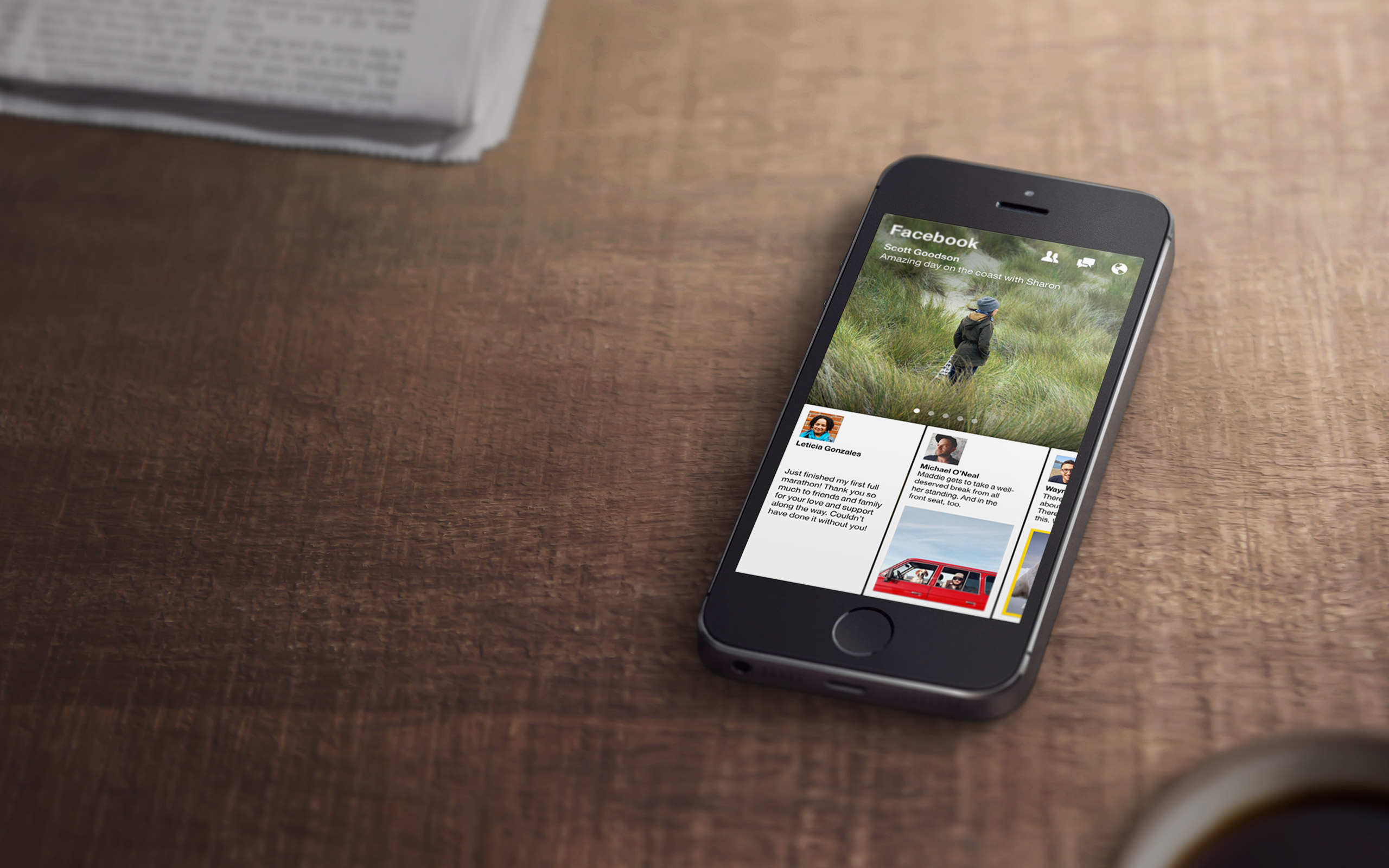
First things first. What is Paper? It’s a new stand-alone app (US-only for now) from Facebook which essentially replace the traditional Facebook iOS app with a very graphical and much more visual approach. The text leaves space to pictures and buttons are replaced by swipes and gestures or rotation of the device.
With Paper, Facebook immediately became a much more interesting application especially because you can mix your timeline with other beautifully curated contents. As a matter of fact I relegated my timeline to the last slot, giving Headlines and Creators hub a more prominent role.


It’s very difficult to describe the experience of using Paper. Probably the best comparison that you could make would be with Flipboard. You can flick through stories by looking at cover arts and titles, from a very high point and once you find something interesting you can start diving in and go deep into the news.
I like all the set of gestures which are coming straight from the technology behind what was once PushPopPress (company founded by Matas, responsible for the Al Gore’s book Our Choice and then later bought by Facebook) and makes the entire experience of Paper more user friendly and intimate. Because your swiping away you definitely feel more connected to the story you are reading.
After just two days, Paper has already replaced the “old” Facebook app on my iPhone home screen. I wish this is not going to remain a side experiment but hopefully it will “contaminate” the main app creating a better experience for all the users.